Turn Up the Heat!
Heat Maps
Learning Technical Analysis is a never ending journey. Rightly so, because old methods become obsolete as Day Traders begin using them and the “edge” that once existed with a new technique, disappears.
That said, there are a few Technical Analysis constants that remain and provide Traders with an insight that can be used to plan and prepare for battle; and, the use of “Heat Maps” is one of them!
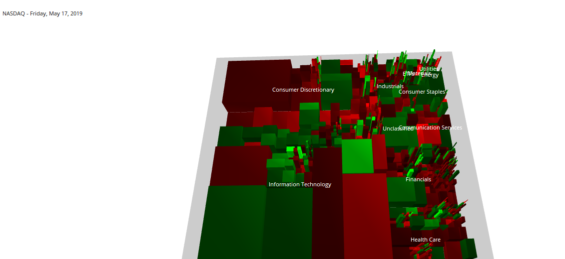
A "Heat Map" is a three dimensional visual representation of data using colors to provide different conditional values. For example, looking at the chart of the NASDAQ, we see this “Heat Map” and our eyes are quickly drawn towards the large green and red “blocks.”
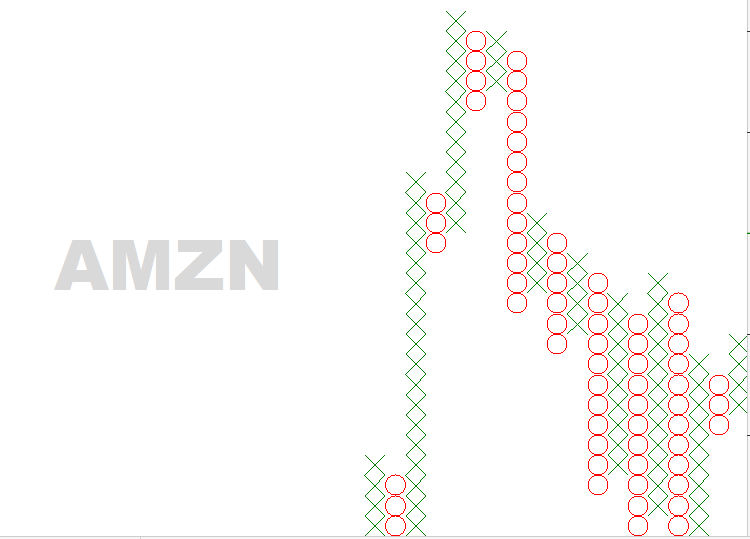
This is good a thing because, in an instant, we can see which market sectors are performing well vs. those that are not. Seeing this heat map gives us an ability to begin our analysis of the stock we want to examine and possibly trade. Quickly, we notice that the Information Technology sector is outperforming the Consumer Discretionary sector. If our intentions were to go “long” in Amazon (AMZN) – seeing “red” would make us think twice. Conversely, our focus for the day would shift towards buying Google (GOOGL) – since this company is covered in “green.”
The point here, is that traditional Technical Analysis indicators do not ALWAYS have to be on a chart using lines and graphs. Indeed, the use of non-traditional methods such as Heat Maps can offer you just as good, trading analysis.
That said, the question remains: “How do you know which Heat Map to look at before you begin trading and can these Heat Maps change during the day?
I can help you answer that through consultation; contact me today!
Like what you read?
Then, subscribe to our Newsletter for more Market observations and analysis!