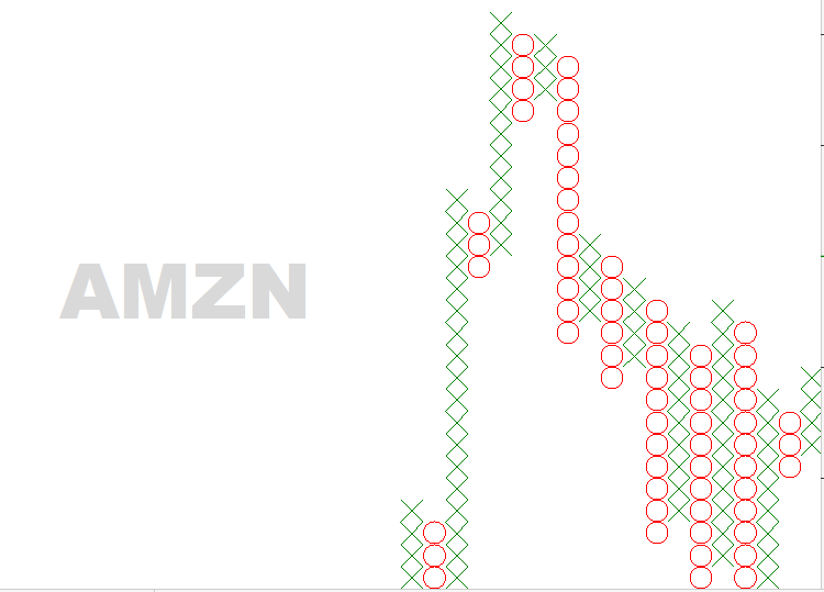
Point & Figure! (AMZN)
Using P&F charts to trade.
Often, your training as a trader can be grueling, demanding and formidable. It is only with hard work and determination that you can begin to unlock the “secrets” of how Technical Analysis interacts with the Market and offers rewards beyond imagination. Learning new ideas and disciplines within the field of technical analysis can be a lifelong pursuit; but it doesn’t mean that you cannot profit from new concepts (or old) and quickly understand how it fits into your way of trading.
Point & Figure Charting is one example.
Although no one knows exactly when this method of Technical Analysis was developed, it can be traced back to the late 19th century and was a form of analysis used by Charles Dow.
Although too vast a subject to begin to discuss here, I wanted to touch upon and mention some key ideas about it. Firstly, Point & Figure (P&F) Charting unlike all other forms of analysis – does NOT take time into consideration. The price action of a security is viewed and recorded only by its rise or fall. Secondly, the construction of a P&F chart is made up of X’s, representing an increase in price and by O’s, representing a decrease in price.
These X’s and O’s (Isn’t that a country song?) provide a visual representation of the price of a security. Traders who use P&F charts, will observe how these X’s and O’s form and how they respond to price change. Let’s look at an example.
As of February 15th, Amazon (AMZN) shows a column of X’s, representing an increase in its price. You can get a sense of how the stock has performed by noticing how it has been in a decline (look at how the X’s and O’s have been slanting downward). Now that we notice a column of X’s, we can hypothesize whether this is a change in trend to the upside or not. The question is: How do you determine if you are reading this P&F chart correctly? And, how do you begin to trade it?
I can help you answer that through consultation; contact me today!
Like what you read?
Then, subscribe to our Newsletter for more Market observations and analysis!